Valferramenta
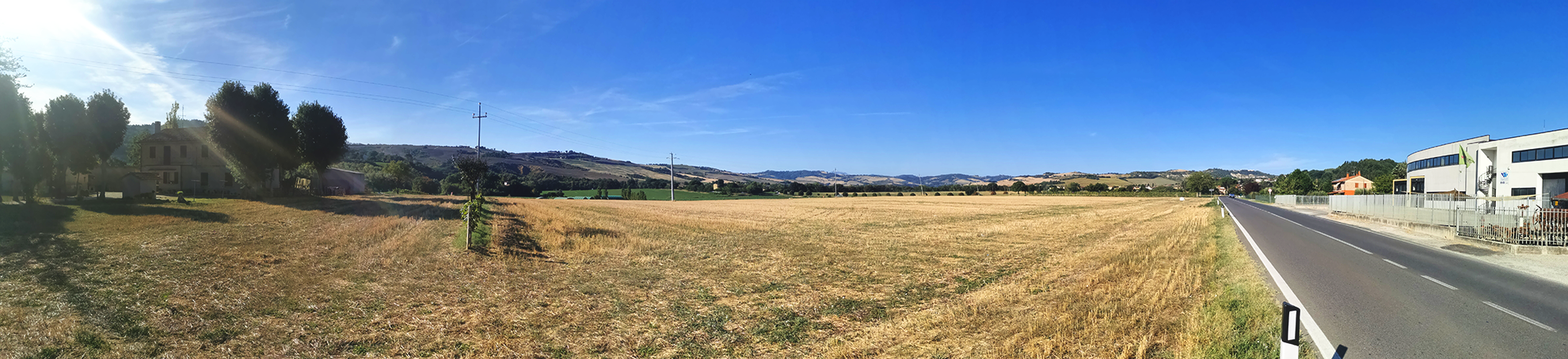
VALLEFOGLIA
“Valle del fare e della laboriosità”
Logo Restyling
Original Logo

Symbol Restyling




Logotype Restyling



2 Symbol & Logotype Combinations


Concepts
Proposal 1
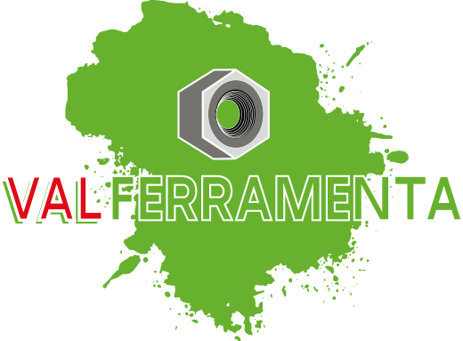
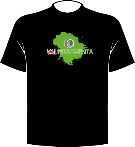
The expressive gesture of the paint stroke is contrasted with the precision and rigidity of the bolt


Proposal 2
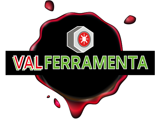
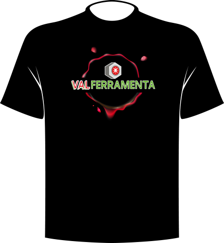
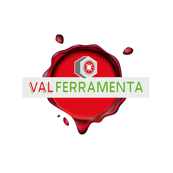
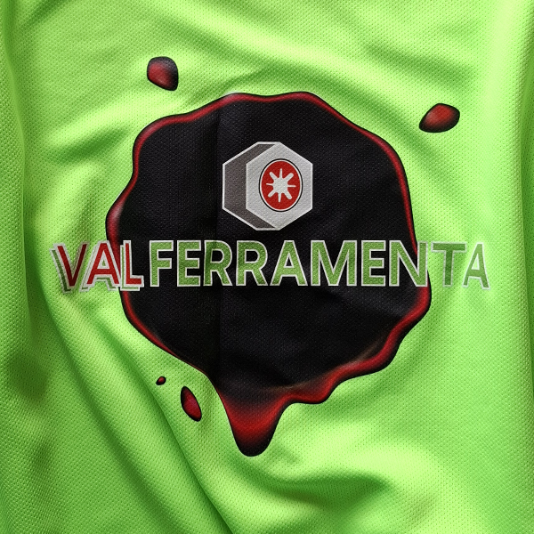
Medieval wax seal as a symbol of quality, trust and credibility, celebrating 25 years of experience

Selected Proposal: Logo Applications
Examples of the logo on different neutral backgrounds











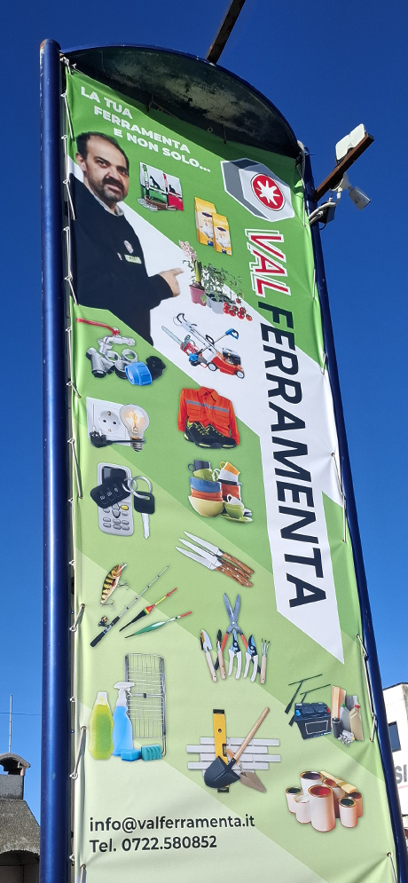
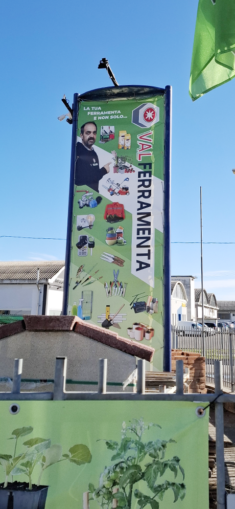
Exterior Signage
Product Categories
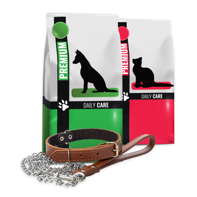
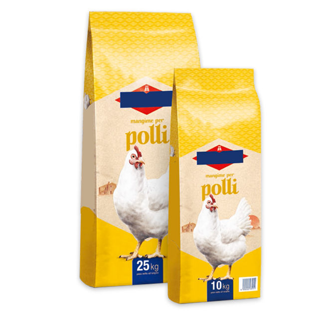
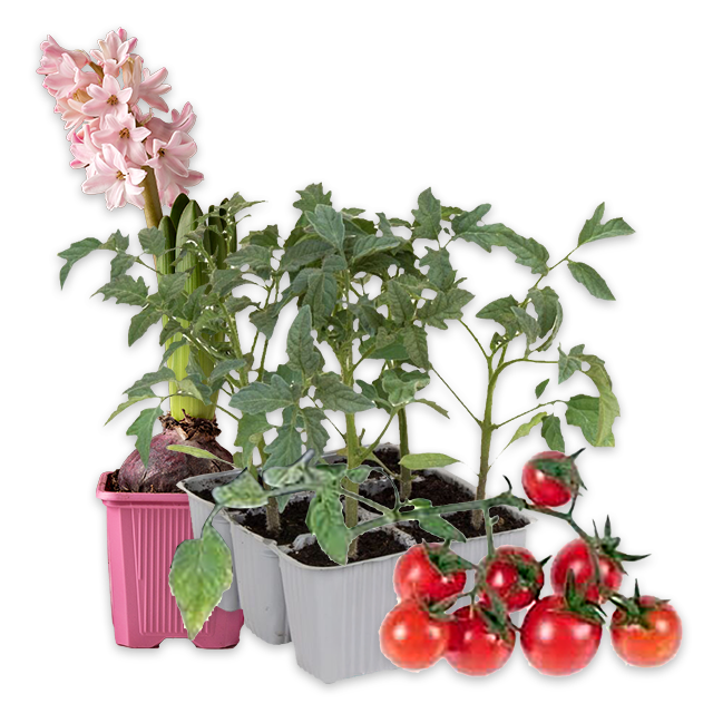


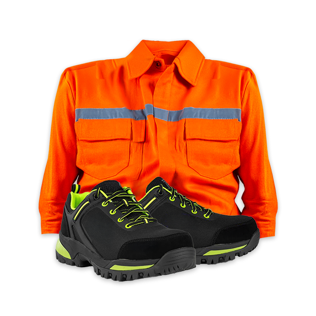

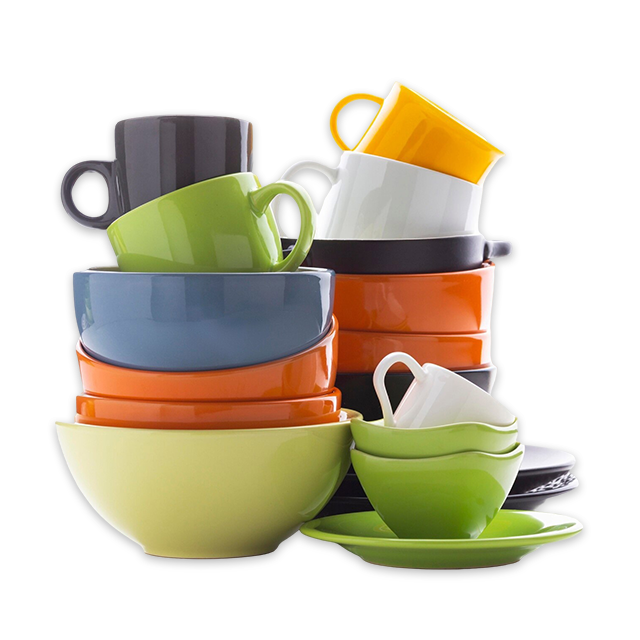

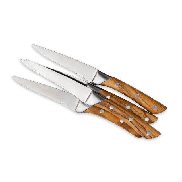

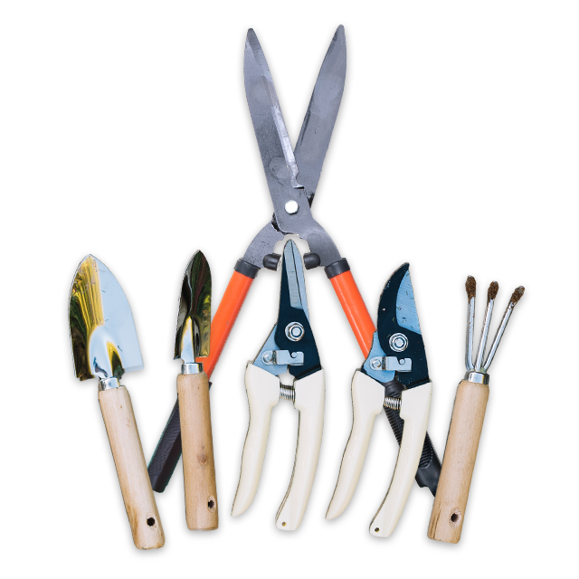


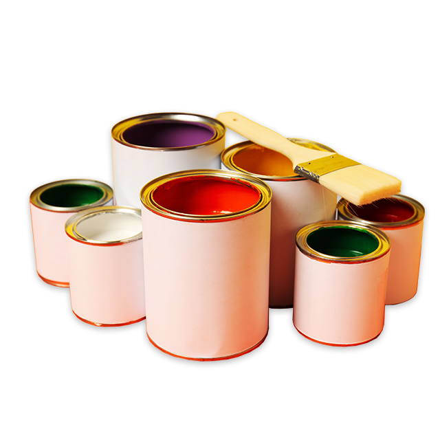
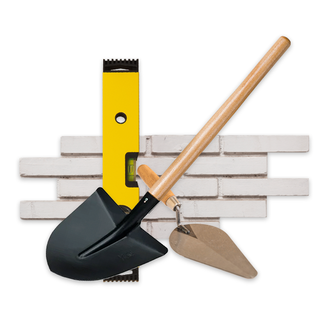
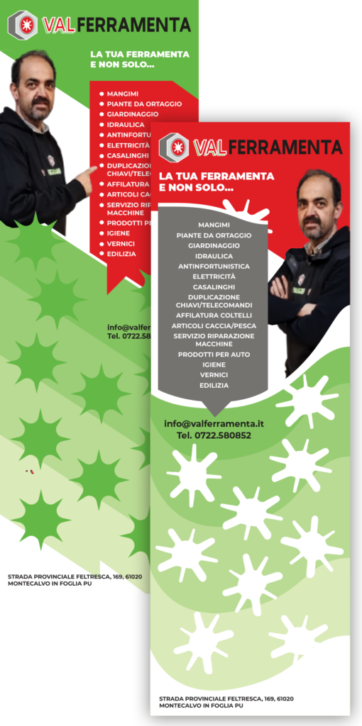
2 Design Concepts
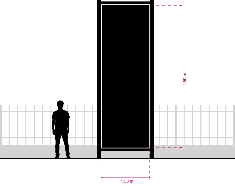
Signage Dimensions & Scale
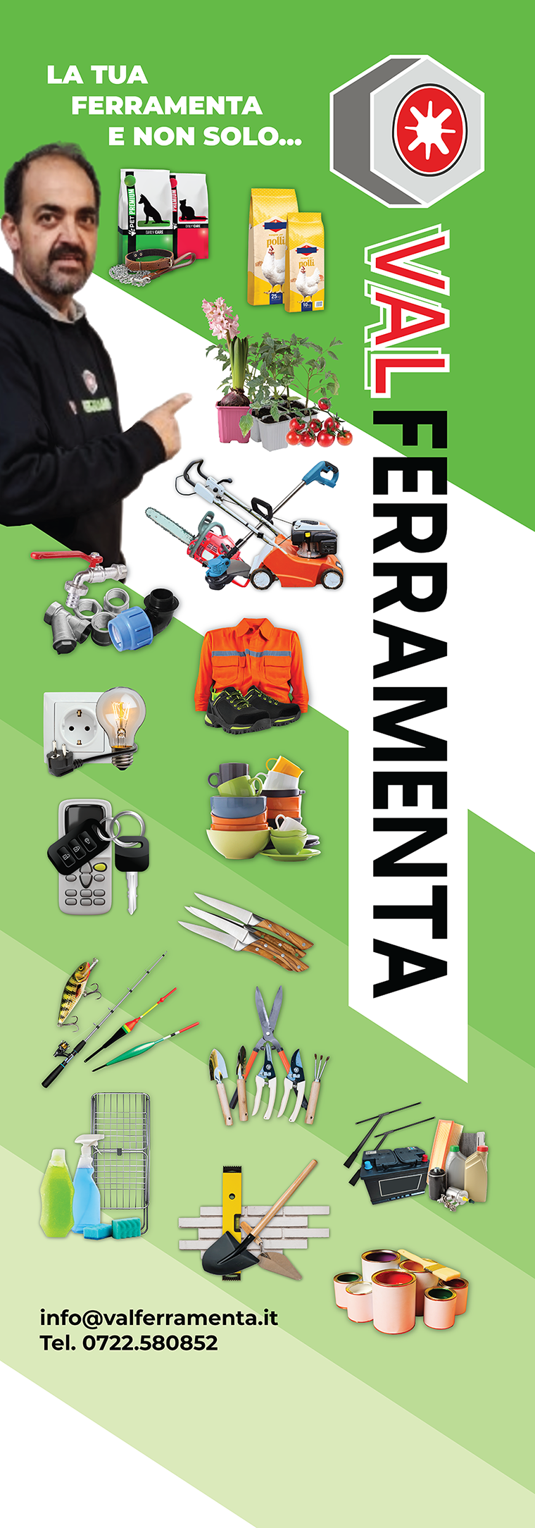
Final Artwork
Behind the Curtain
Valferramenta — 25th Anniversary
For Valferramenta’s 25th anniversary, the brief was to redesign the logo and develop a visual concept that could communicate the company’s credibility, professionalism and reliability.
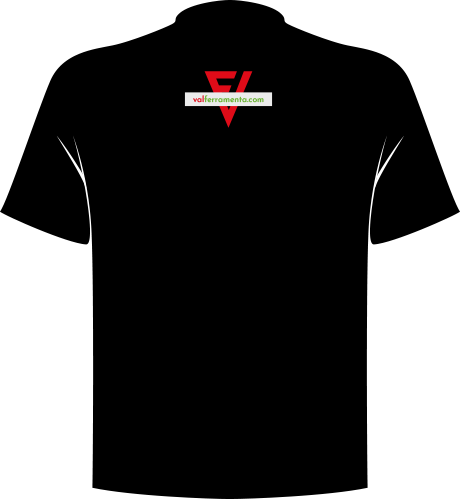
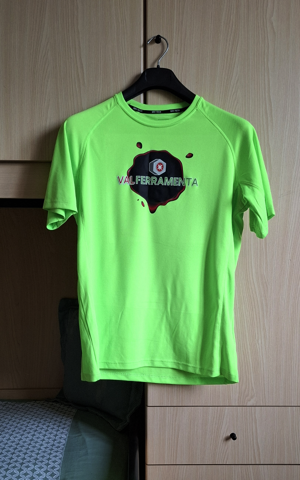
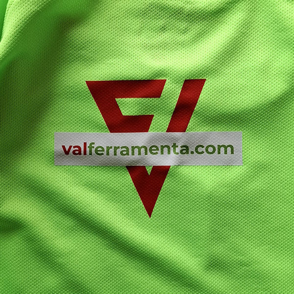
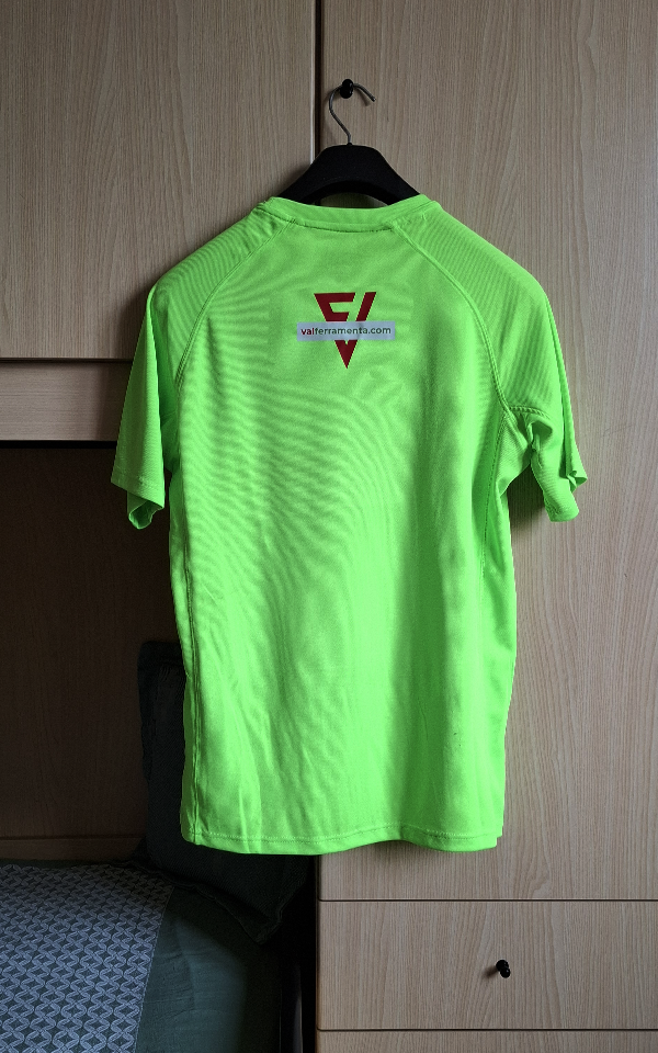
The first application was specifically designed for a series of T-shirts: some intended as gifts for clients, others created to support the company’s sponsorship of the local football team.
The challenge was to give Valferramenta a stronger and more recognisable presence, combining a distinctly Italian colour palette with a visual concept capable of expressing the quality of its products and services.
This led to the idea of a “seal of guarantee”, conceived as a contemporary interpretation of the traditional medieval wax seal. Historically used to authenticate documents, agreements and official acts, the seal became a visual metaphor for trust, authenticity and quality.
The concept also draws on the cultural identity of the surrounding area, with a subtle reference to nearby Urbino — one of Italy’s most renowned Renaissance centres of art, architecture and culture.
From concept to signage
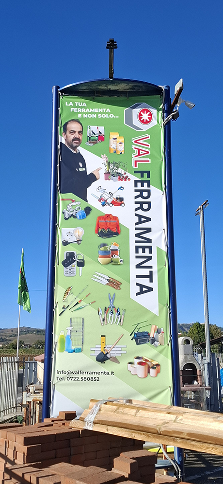
The project was later extended to the company’s exterior signage. Here, the visual language was deliberately adapted to a different context of use.
Rather than carrying the seal over into the signage, I chose a more direct, didactic and functional approach, prioritising legibility, immediacy and visibility for people passing by car. In this context, the seal would have been redundant and would have weakened the impact of the primary message.
The flags framing the exhibition area complete the intervention, giving the location a stronger and more distinctive presence along the road.
My thanks to Gianluca Magnani, owner of Valferramenta, for the trust he placed in my work.

© Valferramenta 2025-2026. No use without permission.