WabiSabi

SUSHI BAR
Cucina giapponese
Logo
Ideogram and logotype
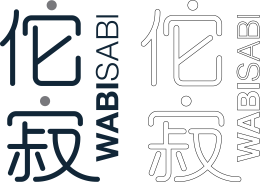

Color palette

Visual Identity Applications
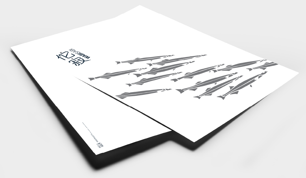
Postcard
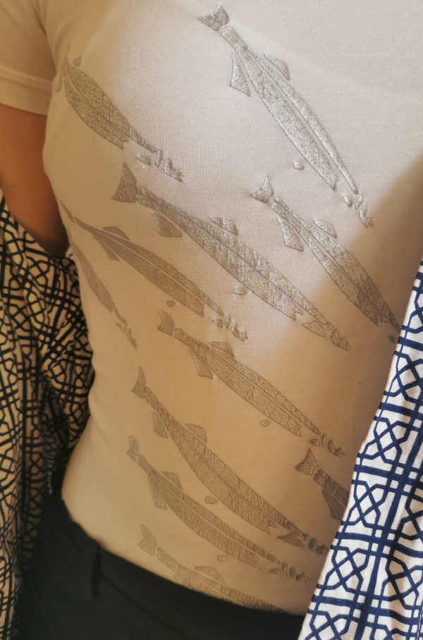
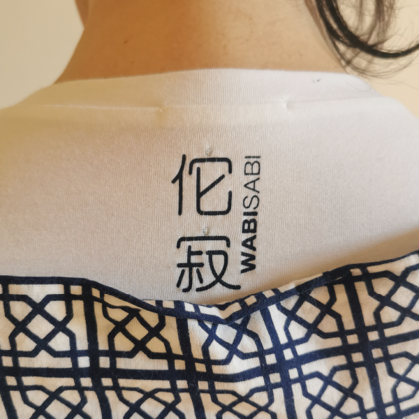
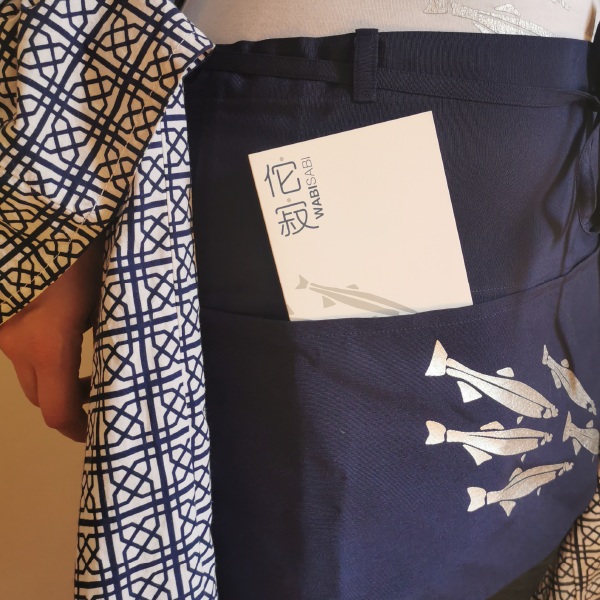
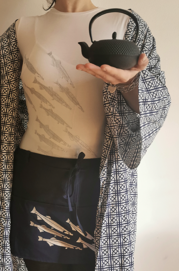
T-Shirt, Kitchen Apron, Menu
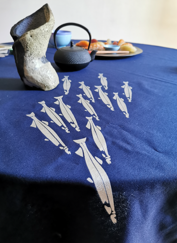
Tablecloth
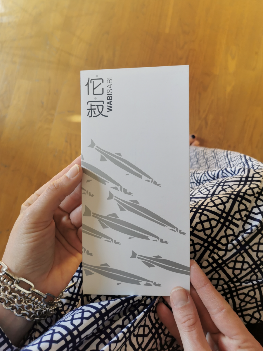
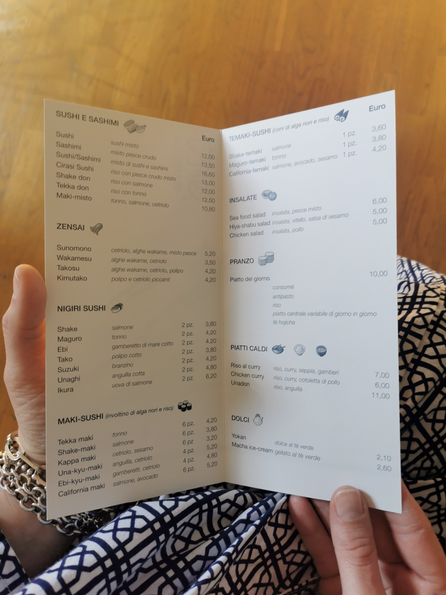
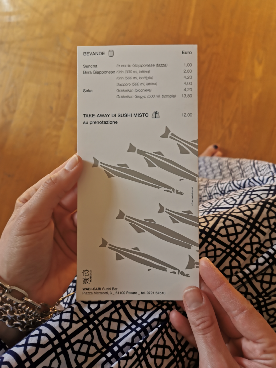
Menu
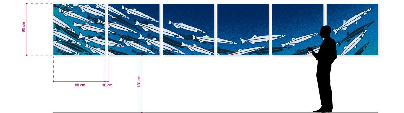
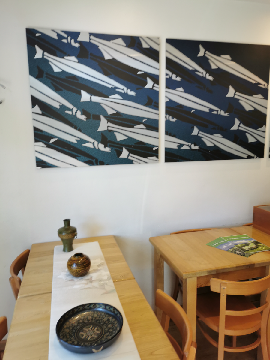
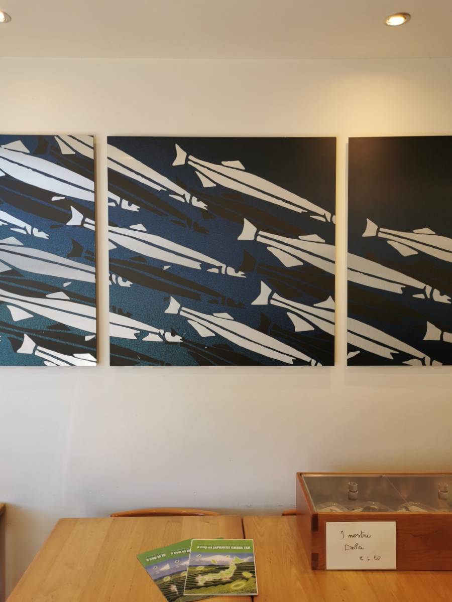
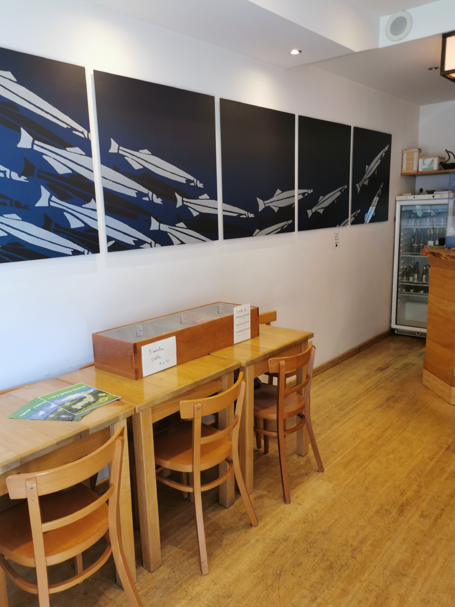
Decorative Panel: Design, 3D Simulation & Final Installation
Signage
Behind the scenes
In 2002, together with my university colleague Michele Urbinelli, I developed the concept and visual identity for a new Japanese restaurant in Pesaro, Italy.
The owner Matsushita Matsusan, originally from Japan and the supervisor of our university thesis, involved us in the project at a time when Japanese cuisine was still relatively uncommon in Italy.
The brief extended from the visual identity to the elements that would shape the experience of the restaurant, from communication materials to decorative elements within the space.
Wabi Sabi
The name itself provided the starting point for the project. Wabi Sabi refers to a Japanese aesthetic sensibility associated with simplicity, authenticity, imperfection and transience.
We translated this concept into an essential visual language built around a small number of recurring elements.
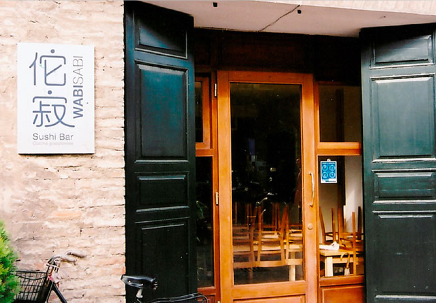
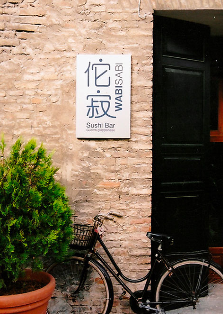
The logo is based on the vectorised stylisation of two Japanese characters, accompanied by the smaller WABISABI logotype: a sort of visual translation intended to make the name immediately readable to a Western audience.
The colour palette is limited to blue and silver.
A Visual Language Across the Space
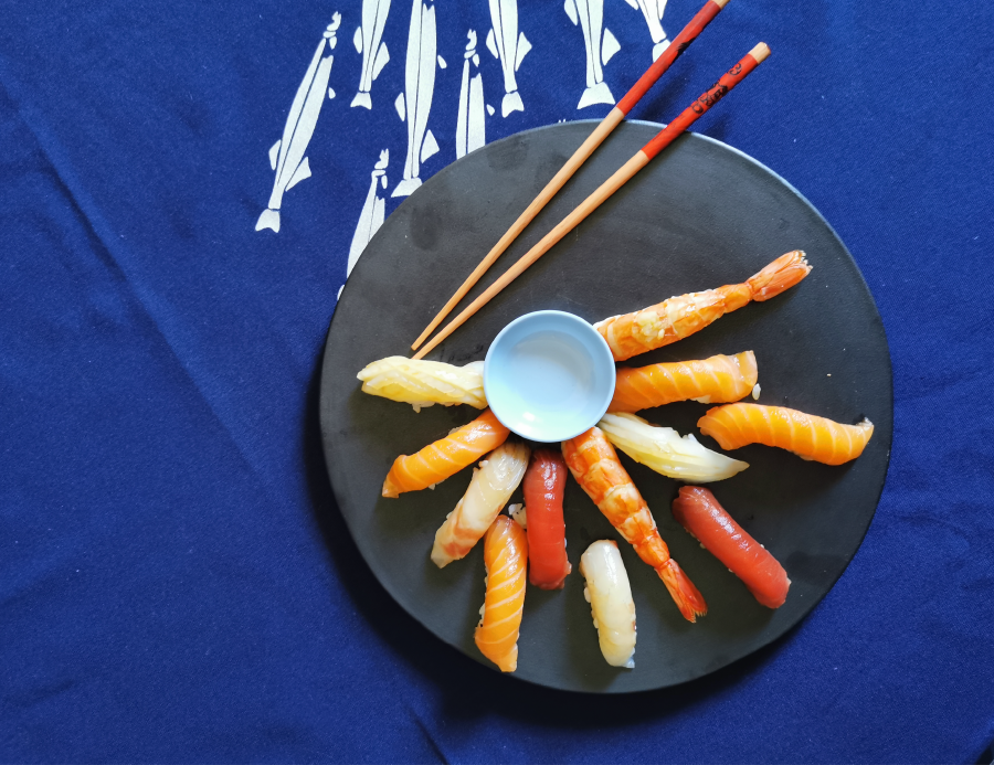
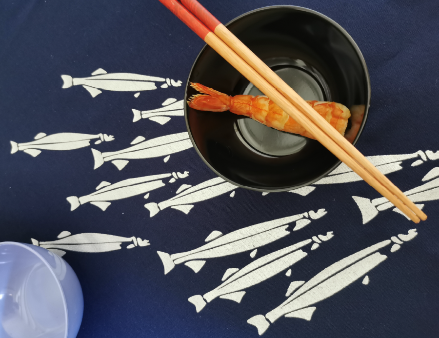
A second distinctive element was developed from the tracing and vectorisation of an old illustration depicting fish in profile. The drawing was transformed into a fluid, delicate pattern and used across the different applications.
Inside the restaurant, the pattern becomes a continuous composition spread across six square forex panels placed side by side, turning an element of the visual identity into a decorative surface within the space.
The identity was therefore conceived as a system capable of moving from communication to environment while maintaining visual coherence.
3D Spatial Simulation
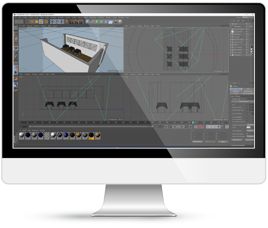
Before the restaurant was built, I developed a 3D simulation to show the client how the concept would work within the available space.
Rather than being a technical representation, it was primarily a visualisation tool: it allowed us to anticipate the final result and assess how effectively the identity could integrate with the environment, helping the client decide to move forward with the project.
Note
Project developed in 2003 with Michele Urbinelli. We are no longer involved with the client, but the project remains a testimony to an integrated approach combining concept, visual identity, communication and space.
A Special Thanks
A special thanks to Massimo Dolcini, our professor, graphic designer and friend, who introduced us to the client and helped make this project possible.
© Santoriello-Urbinelli 2002-2003. No use without permission.